Know how directly from the Microsoft 365 mail merge experts
Der Gewinnleitfaden für E-Mail-Design (3 Beispiele + Vorlagen)
In der heutigen digitalen Landschaft schwinden die Aufmerksamkeitsspannen, und der Wettbewerb um Engagement ist hart. Daher sind Design und Ästhetik jetzt genauso wichtig wie der tatsächliche Inhalt einer bestimmten Kommunikation.
Idealerweise sollten die beiden nahtlos zusammenarbeiten, wobei das visuelle Layout, die Typografie, Bilder und andere Elemente die Schlüsselbotschaften und Handlungsaufforderungen verstärken und ins Rampenlicht rücken.
In diesem umfassenden Leitfaden zum E-Mail-Design werden wir die Bedeutung durchdachter Designentscheidungen kennenlernen, um deine E-Mail-Marketingkampagnen zu optimieren und stärkere Verbindungen zu deinen Empfängern aufzubauen.
Lass uns anfangen!
Die Bedeutung von E-Mail-Designvorlagen
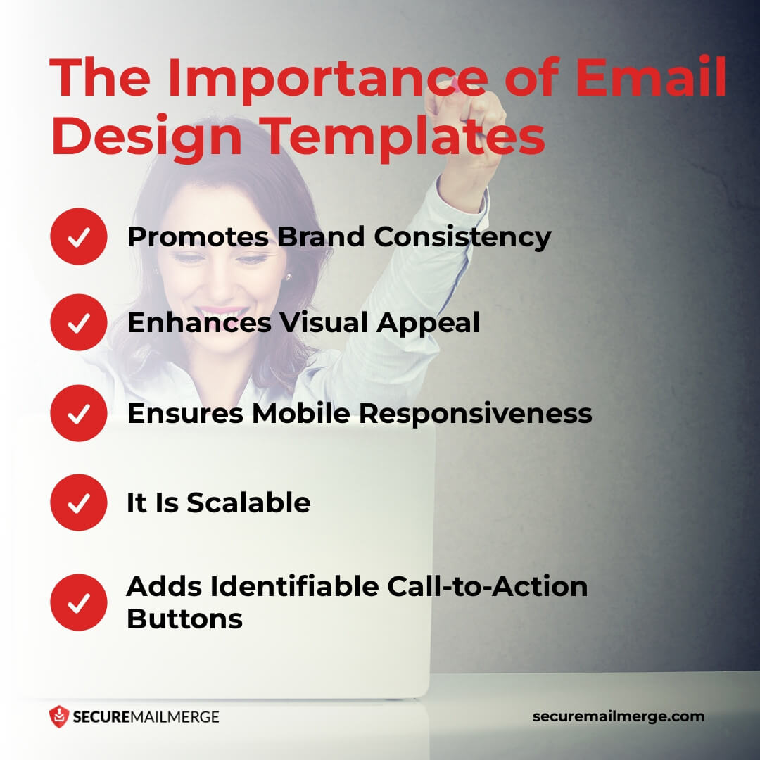
Eine E-Mail-Vorlage ist ein vorgefertigtes Layout, das es Marketern ermöglicht, professionelle, visuell ansprechende E-Mails einfach zu erstellen und zu versenden. Diese Vorlagen bieten viele Vorteile, die die Kommunikation optimieren, Zeit sparen und die Markenidentität stärken.
Hier sind die wichtigsten Gründe, warum die Integration von E-Mail-Designvorlagen in deine E-Mail-Marketingstrategie ein Game Changer ist.
1. Fördert die Markenidentität
E-Mail-Design bietet die Möglichkeit, deine Markenidentität zu verstärken. Konsistenz in Designelementen wie Farbpalette, Typografie und Bildern schafft ein einheitliches Markenerlebnis.
Ein Bericht von Lucidpress, der über 200 Fachleute im Markenmanagement befragte, zeigt, dass eine konsistente Markenpräsentation den Umsatz um 33 Prozent steigert.
2. Steigert die visuelle Anziehungskraft
Der visuelle Aspekt des E-Mail-Designs kann die Interaktion erheblich beeinflussen. Vorlagen, die auffällige visuelle Elemente, ausgewogene Layouts und ansprechende Typografie enthalten, können die Gesamtästhetik und Anziehungskraft deiner E-Mails verbessern.
3. Gewährleistet mobile Responsivität
Mehr als 41 Prozent der E-Mail-Ansichten stammen von mobilen Geräten. Eine E-Mail-Vorlage mit einem responsiven Design, das sich nahtlos an verschiedene Bildschirmgrößen und -auflösungen anpasst, sorgt für ein positives Benutzererlebnis, was zu höheren Klickraten führt.
Diese Optimierung verbessert das Benutzererlebnis und führt zu höheren Öffnungsraten, besserer Interaktion und gesteigerten Konversionen.
4. Ist skalierbar
E-Mail-Vorlagen bieten eine skalierbare Lösung, indem sie einen Rahmen bieten, der für verschiedene Kampagnen und Segmente repliziert werden kann. Die Wiederverwendung von Vorlagen sorgt für ein konsistentes visuelles Erscheinungsbild, während sie eine Anpassung des Inhalts ermöglichen, um spezifische Ziele und Zielgruppen zu erreichen. Diese Vielseitigkeit ermöglicht eine effektive Ansprache einer breiteren Kundenbasis und maximiert die Wirkung der E-Mail-Marketingmaßnahmen.
5. Fügt erkennbare Call-to-Action-Buttons hinzu
Erfolgreiche E-Mail-Designs konzentrieren sich auf klare und überzeugende Handlungsaufforderungen (CTAs). Ein geschickt gestalteter CTA-Button, der strategisch in einer E-Mail platziert ist, hat die Kraft, die Klickraten zu erhöhen und Konversionen zu fördern.
Die Integration von E-Mail-Designvorlagen in deine E-Mail-Marketingstrategie kann revolutionieren, wie du professionelle, visuell ansprechende E-Mails erstellst und versendest. Ein nützliches kostenloses Plugin für E-Mail-Vorlagen in Outlook ist TemplateManager365. Damit kannst du wunderschön gestaltete E-Mails erstellen und versenden, die dein Publikum fesseln und bedeutungsvolle Interaktionen fördern.
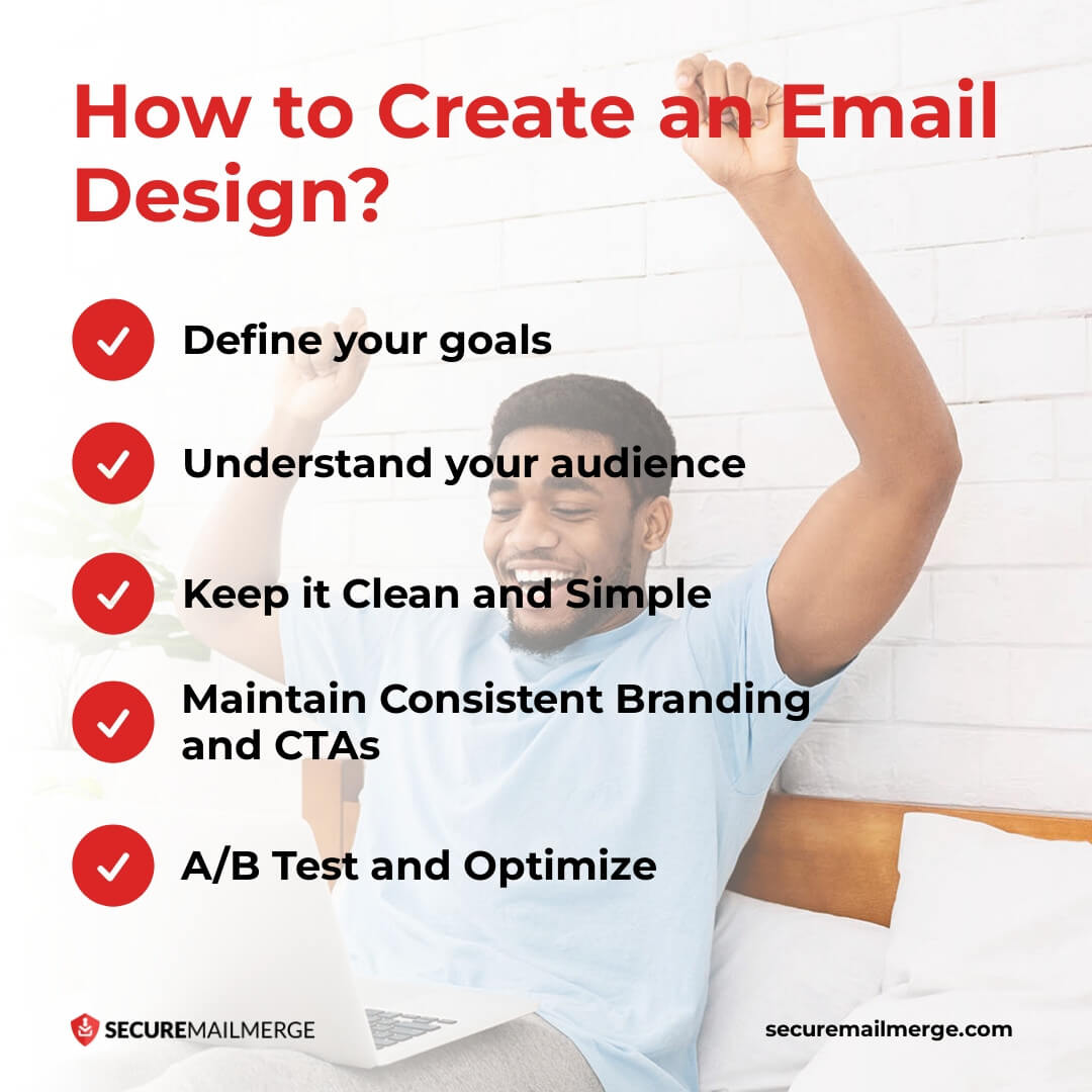
Wie erstellt man ein E-Mail-Design?
Ein gut gestaltetes E-Mail spricht die Empfänger visuell an, kommuniziert deine Botschaft effektiv und motiviert sie zum Handeln. Jedes Element spielt eine Rolle bei der Erstellung eines E-Mail-Designs, das heraussticht, von Layout und Farbwahl bis hin zu ansprechenden Bildern und überzeugendem Text. Im Folgenden werden wir die wichtigsten Prinzipien und Best Practices erkunden, die dir helfen, aufregende Designs zu erstellen, die deine Botschaft effektiv vermitteln, zum Handeln inspirieren und Ergebnisse liefern.
1. Definiere deine Ziele
Beginne damit, die Ziele deiner E-Mail-Kampagne zu klären. Ob du ein Produkt bewirbst, wertvolle Inhalte teilst oder Kundenbeziehungen pflegst, eine klare Definition deiner Ziele wird deine Designentscheidungen leiten.
2. Verstehe dein Publikum
Lerne die Vorlieben, Interessen und Verhaltensweisen deiner Zielgruppe kennen. Dieses Verständnis wird deine Designentscheidungen beeinflussen, einschließlich Farbpaletten, Typografie, Bilder und Tonfall, sodass du E-Mails erstellen kannst, die bei deinen Empfängern Anklang finden.
3. Halte es sauber und einfach
Ein überladenes und überwältigendes Design kann Empfänger davon abhalten, sich mit deiner E-Mail zu beschäftigen. Strebe ein sauberes, minimalistisches Layout an, das deine Hauptbotschaft hervorhebt und unnötige Ablenkungen vermeidet. Nutze den weißen Raum strategisch, um die Lesbarkeit zu verbessern und den Fokus des Lesers zu lenken.
4. Halte konsistente Markenbildung und CTAs aufrecht
Integriere die visuellen Elemente deiner Marke konsistent im gesamten E-Mail-Design, um Wiedererkennung und Vertrauen aufzubauen.
Betone einen klaren und überzeugenden CTA, der die Empfänger zum Handeln auffordert. Verwende kontrastierende Farben, um deine CTAs von den restlichen Inhalten deiner E-Mail abzuheben. Stelle sicher, dass deine CTAs prägnante und einfache Sprache verwenden, um Hindernisse zwischen deinen Empfängern und ihren angestrebten Zielen zu minimieren.
5. A/B-Testen und optimieren
Bevor du deine E-Mail versendest, teste sie gründlich auf verschiedenen Geräten, E-Mail-Clients und Webbrowsern, um sicherzustellen, dass sie korrekt angezeigt wird.
Führe A/B-Tests durch, um mit verschiedenen Designelementen zu experimentieren und deren Einfluss auf Öffnungsraten, Klickrate und Konversionen zu messen. Analysiere die Ergebnisse und iteriere dein Design, um deine E-Mail-Kampagnen zu optimieren.
6 Elemente eines guten E-Mail-Designs
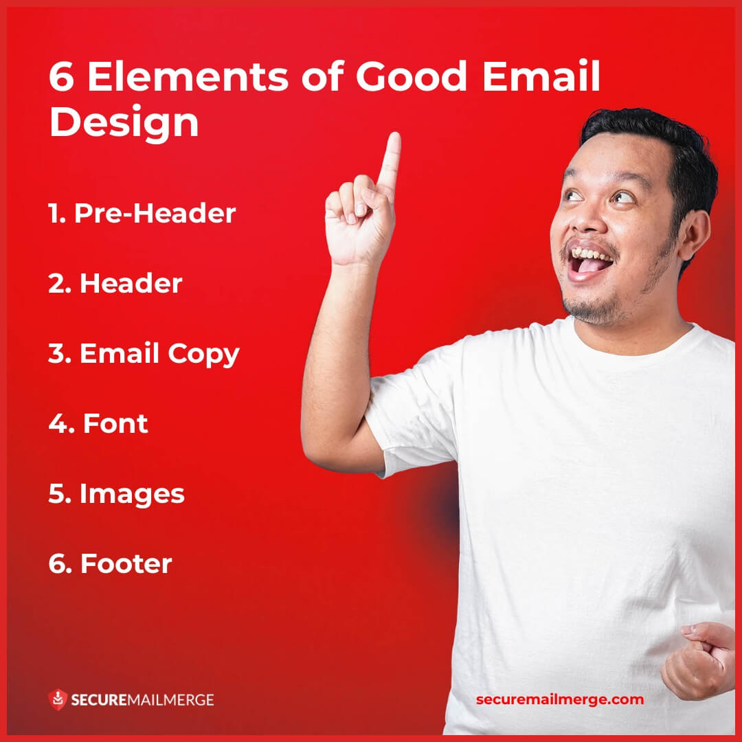
Eine gut gestaltete E-Mail erfordert sorgfältige Überlegungen zu einer Mischung von Elementen, die gemeinsam zur Effektivität und Wirkung der E-Mail beitragen.
In diesem Abschnitt werden die wichtigsten Komponenten für das Erstellen ansprechender und visuell ansprechender E-Mails untersucht. Vom Pre-Header bis zur Fußzeile hat jedes Element einen bestimmten Zweck, um Aufmerksamkeit zu erregen, Informationen zu vermitteln und gewünschte Aktionen zu fördern.
Erstelle visuell ansprechende und fesselnde E-Mails, indem du die folgenden Elemente beim Entwerfen oder Auswählen einer E-Mail-Vorlage berücksichtigst.
1. Pre-Header
Der Pre-Header und der Vorschautext sind entscheidende Komponenten einer E-Mail, da sie einen Einblick in die Nachricht geben, bevor sie vollständig geöffnet wird. Um einen guten Pre-Header zu erstellen, halte ihn kurz (zwischen 30 und 70 Zeichen), personalisiere ihn, vermeide es, die Betreffzeile zu wiederholen, füge Wert hinzu und stelle sicher, dass er auf mobilen Geräten responsiv ist.
2. Header
Der Header dient als Verpackung deiner E-Mail und ist der erste Eindruck bei den Empfängern. Ein ansprechender Header sollte visuell ansprechend, bedeutungsvoll und ein Vorgeschmack auf das Kommende sein.
Die Kombination aus Text und relevanten Bildern sollte eine auffällige Überschrift, wichtige Links und prägnante Beschreibungen enthalten, die den Hauptinhalt der E-Mail zusammenfassen.
3. E-Mail-Text
Selbst wenn der Fokus auf dem Design liegt, ist gut geschriebener Text für die Gesamtwirkung einer E-Mail nach wie vor entscheidend. Halte die Nachricht kurz, ansprechend und auf die Vorlieben deiner Zielgruppe abgestimmt. Vermeide es, 200 Wörter zu überschreiten, und passe die Sprache an, um beim Leser Resonanz zu erzeugen. Klarer und effektiver Text stellt sicher, dass die Empfänger die beabsichtigte Nachricht verstehen und die gewünschte Aktion ausführen.
4. Schriftart
Die Wahl der richtigen Schriftart ist entscheidend, um eine konsistente und lesbare Darstellung auf verschiedenen Geräten und E-Mail-Clients zu gewährleisten. Wähle einfache, markenkonforme und leicht lesbare Schriftarten. Halte dich an maximal zwei Schriftarten in der gesamten E-Mail, verwende serifenlose Schriftarten für den Fließtext und bestimme angemessene Schriftgrößen für den Fließtext (14pt bis 16pt) und die Überschriften (22pt bis 24pt).
5. Bilder
Bilder sind kraftvolle Elemente im E-Mail-Design, die Aufmerksamkeit erregen und Botschaften schnell vermitteln. Wähle hochauflösende Bilder, die relevant für den Inhalt sind und mit dem Stil deiner Marke übereinstimmen. Halte die Dateigrößen unter 1MB im PNG-Format, um schnelle Ladezeiten und Engagement zu gewährleisten.
Bedenke die folgenden Überlegungen zu Bildern.
-
Größe
Berücksichtige die Größe deiner Bilder und das gesamte E-Mail-Design, um Ladezeiten zu optimieren und verschiedene Bildschirmgrößen zu berücksichtigen. Hochauflösende Bilder sollten visuelle Wirkung und Dateigröße ausbalancieren, um das Engagement des Publikums aufrechtzuerhalten.
-
Zweck
Stelle sicher, dass jedes Bild in der E-Mail einen strategischen Zweck erfüllt und dem Inhalt einen Mehrwert bietet. Vermeide es, Bilder nur der Aufnahme willen hinzuzufügen. Jedes visuelle Element sollte die Botschaft verstärken und beim Publikum Resonanz erzeugen.
-
Stockbilder vs. benutzerdefinierte Bilder
Während benutzerdefinierte Bilder eine einzigartige Markenidentität und Botschaft ermöglichen, können auch Stockbilder effektiv genutzt werden. Wenn du Stockbilder verwendest, stelle sicher, dass sie einzigartig sind und nicht häufig von Wettbewerbern verwendet werden. Strebe nach Originalität, um die Identität deiner Marke zu stärken.
-
Hintergründe
Wenn du Text über Bilder einfügst, wähle Hintergründe, die nicht übermäßig gemustert oder komplex sind, um sicherzustellen, dass sie ausreichend Kontrast für die Lesbarkeit des Textes bieten. Sorgfältig ausgewählte Hintergründe verbessern die visuelle Anziehungskraft und ermutigen die Empfänger, den Inhalt der E-Mail zu erkunden.
-
Alt-Text
Die Einbeziehung von Alt-Text für Bilder ist entscheidend für die Barrierefreiheit. Alt-Text stellt sicher, dass Empfänger, die Bilder deaktiviert haben oder Bildschirmlesegeräte verwenden, den Inhalt und den Kontext der Bilder verstehen können. Diese Praxis verbessert die Benutzererfahrung und verhindert Verwirrung oder Frustration.
-
Farben
Die Auswahl harmonischer Farben ist entscheidend für die Erstellung einer visuell ansprechenden E-Mail. Halte dich an eine definierte Farbpalette, die mit der Identität deiner Marke übereinstimmt, hebe Abschnitte mit kontrastierenden Farben hervor und verwende nicht mehr als drei Farben in der gesamten E-Mail. Stelle sicher, dass die Hintergrund- und Textfarben einander ergänzen, um die Lesbarkeit zu optimieren.
6. Fußzeile
Die Fußzeile der E-Mail enthält oft wichtige Informationen und handlungsorientierte Elemente. Füge Kontaktdaten, Profile in sozialen Medien und einen Abmeldelink hinzu. Nutze die Fußzeile kreativ, um dein einzigartiges Verkaufsversprechen, die Kernwerte deiner Marke, den Unternehmensslogan, die Standorte oder exklusive Gutscheincodes zu präsentieren.
Um mehr darüber zu erfahren, wie du großartiges Design nahtlos in deine E-Mails integrierst, schau dir unseren ausführlichen Leitfaden an, wie man E-Mail-Vorlagen erstellt, die dir Kunden bringen.
E-Mail-Layout
Ein erfolgreiches und ansprechendes E-Mail-Design zu erreichen, erfordert mehr als nur das Befolgen einzelner Best Practices. Es ist wichtig, ein Gleichgewicht zwischen verschiedenen Elementen zu finden, um Verwirrung und Frustration bei deinen Lesern zu vermeiden.
Betrachtet die folgenden Aspekte: Text-zu-Bild-Verhältnis, Weißraum und räumliches Gleichgewicht.
Text-zu-Bild-Verhältnis
Eine E-Mail mit übermäßigem Text oder Bildern zu überladen, kann visuell unattraktiv sein. Um das Gleichgewicht zu wahren, wird empfohlen, die 60/40-Regel zu befolgen, bei der 60 % der E-Mail aus Text und 40 % aus Bildern bestehen. Dieses Verhältnis schafft ein visuell ansprechendes Layout und hilft, Spam-Filter zu vermeiden, die E-Mails mit übermäßigen Bildern kennzeichnen könnten.
Weißraum
Das Schaffen von Weißraum oder negativem Raum in deinem E-Mail-Design ist entscheidend. Wie Kaffeebohnen beim Einkaufen von Parfums ermöglicht Weißraum den Elementen, zu atmen, und sorgt für Klarheit und Fokus. Ausreichend negativer Raum reduziert die Augenbelastung, verbessert die Lesbarkeit und verleiht deiner E-Mail ein sauberes und poliertes Aussehen.
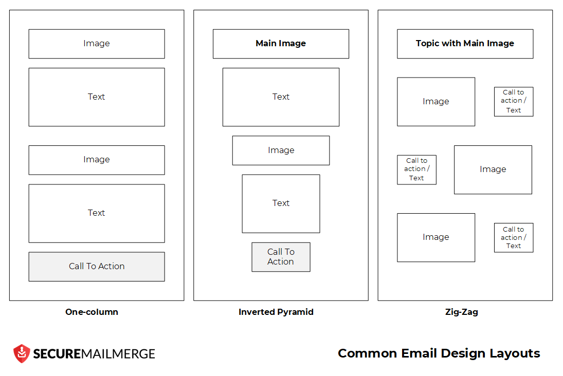
Räumliches Gleichgewicht
Ein räumliches Gleichgewicht zu erreichen, ist wichtig, um wesentliche Elemente in deiner E-Mail richtig darzustellen, wie Bilder, Fließtext und Handlungsaufforderungen (CTAs). Es gibt drei gängige Layouts: das Einspaltige, die umgekehrte Pyramide und das Zickzack. Jedes Design bietet unterschiedliche Anordnungen, um Elemente effektiv zu verteilen und visuelle Harmonie zu schaffen.
3 Beispiele für E-Mail-Design aus der realen Welt
Im E-Mail-Marketing kann es eine wertvolle Ressource sein, sich von realen Beispielen für effektives E-Mail-Design inspirieren zu lassen, um deine Kampagnen zu verbessern.
In diesem Abschnitt betrachten wir drei herausragende Marken – Calm, Uber Eats und J.Crew – und tauchen in ihre E-Mail-Designs ein, die die Empfänger begeistert haben und bemerkenswerte Erfolge erzielt haben.
Die Untersuchung dieser drei Beispiele aus der realen Welt ermöglicht es uns, Einblicke in die Elemente und Strategien zu gewinnen, die außergewöhnliches E-Mail-Design ausmachen.
1. Calm App: Marken-Konsistenz

Calm, die App für psychische Gesundheit, zeigt die Kraft von Marken-Konsistenz und Einfachheit im E-Mail-Design. Mit einem konsistenten Farbschema, beruhigenden Bildern und zielgerichteten Überschriften schafft Calm ein kohärentes Markenerlebnis, das bei den Empfängern Anklang findet. Aus mehreren Gründen ist der E-Mail-Newsletter der Marke ein großartiges Beispiel für effektives E-Mail-Design.
Lass uns in die Schlüsselfaktoren eintauchen, die zu seinem Erfolg beitragen.
Zielgerichtete Überschriften
Die E-Mail beginnt mit einer klaren, zielgerichteten Überschrift: “Erinnerung: Ruhe ist keine Belohnung.” Diese Überschrift zieht sofort die Aufmerksamkeit auf sich und vermittelt die zentrale Botschaft des Newsletters, indem sie die Bedeutung von Ruhe betont. Sie setzt den Ton für den folgenden Inhalt.
Deutlich erkennbare CTA-Buttons
In der gesamten E-Mail sind auffällige und gut gestaltete CTA-Buttons strategisch platziert. Zum Beispiel bieten die Buttons “Hier mehr lesen” und “Hier herunterladen” klare Anweisungen und fördern das Engagement mit zusätzlichen Inhalten. Der Einsatz von kontrastierenden Farben lässt die CTAs hervorstechen und leitet die Empfänger zur Handlung.
Markenabgestimmte Farben und Bilder
Das E-Mail-Design passt nahtlos zur Calm-Marke. Das Farbschema, das überwiegend beruhigende Blautöne enthält, schafft ein Gefühl von Gelassenheit und spiegelt den Zweck der App wider. Darüber hinaus verbessern beruhigende und naturbezogene Bilder die Gesamtästhetik und verstärken den Fokus der Marke auf psychisches Wohlbefinden.
Strukturierter Inhaltsaufbau
Der Inhalt der E-Mail ist in Abschnitte organisiert, was es den Empfängern erleichtert, sich zurechtzufinden und die Informationen zu verarbeiten. Jeder Abschnitt ist visuell klar voneinander abgegrenzt, was ein schnelles Scannen und Verstehen ermöglicht. Überschriften und Unterüberschriften verbessern die Lesbarkeit und führen die Leser durch die verschiedenen Themen.
Relevante und personalisierte Inhalte
Der Newsletter bietet eine Mischung aus kuratierten Inhalten, darunter Schlafgeschichten, Meditationen und Weisheiten. Er bietet den Empfängern einen Mehrwert, indem er direkt auf ihre Bedürfnisse und Interessen eingeht. Die Einbeziehung eines Schlafchronotyp-Quiz und eines monatlichen Calm-Kalenders fügt weitere Personalisierung hinzu und fördert das Engagement mit der App.
2. Uber Eats: Klare CTAs und Personalisierung
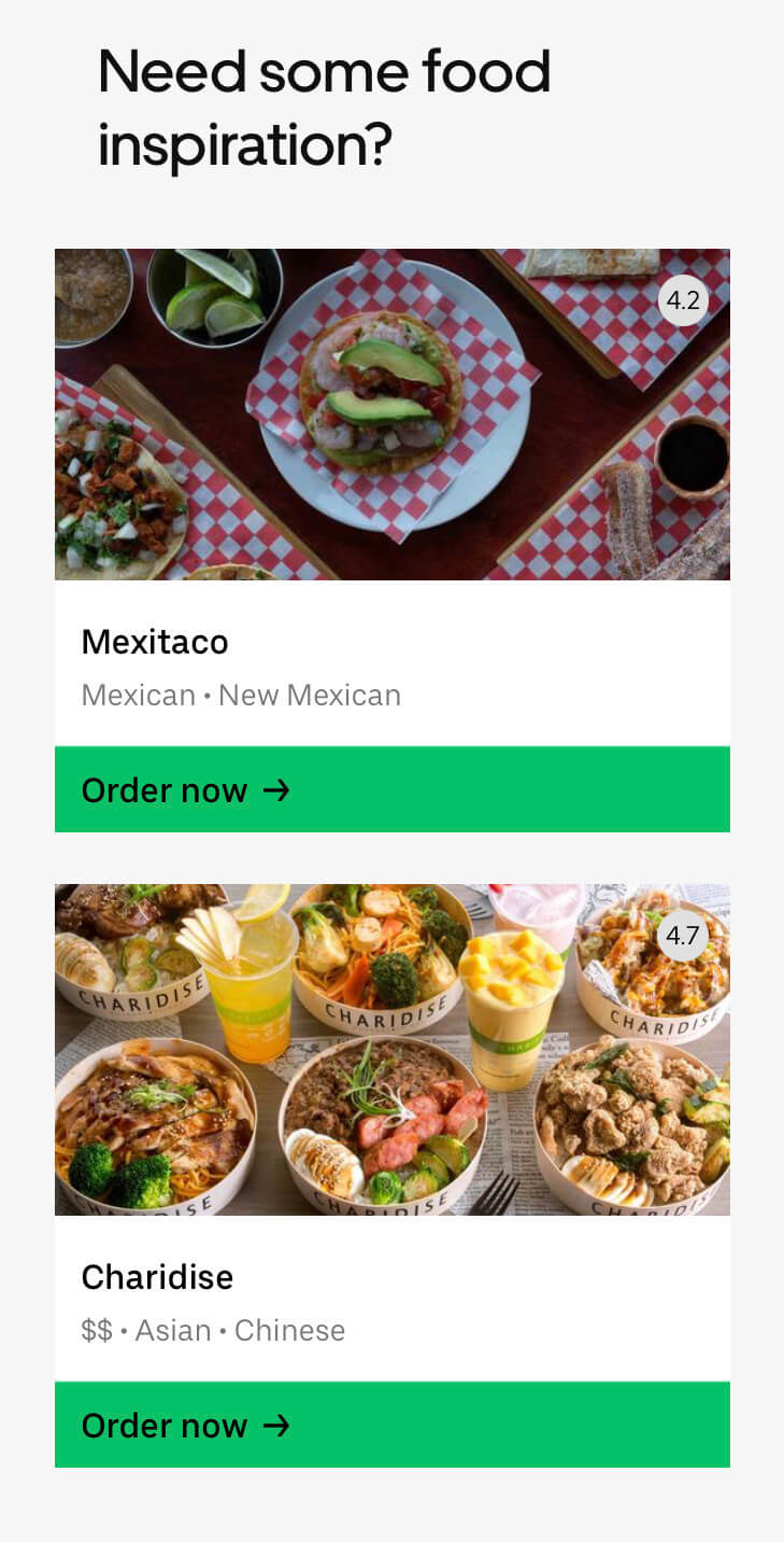
Durch die Nutzung von klaren und gut gestalteten CTAs fordert Uber Eats die Empfänger auf, aktiv zu werden, was es einfach macht, Angebote zu nutzen oder Restaurantoptionen zu erkunden. Die Untersuchung der Designs von Uber Eats bietet Einblicke in die Erstellung gezielter und relevanter Inhalte, die das E-Mail-Erlebnis verbessern.
Hier sind einige Dinge, die sie richtig gemacht haben.
Aufmerksamkeit erregende Betreffzeile
Die Betreffzeile “40% Rabatt auf köstliche Gerichte nur für dich!” zieht sofort die Aufmerksamkeit auf sich und verlockt die Empfänger mit einem verlockenden Angebot. Sie schafft ein Gefühl von Exklusivität, wodurch sich die Empfänger wertgeschätzt fühlen und motiviert sind, die E-Mail zu öffnen.
Klare und überzeugende Handlungsaufforderung (CTA)
Die E-Mail enthält prominent eine CTA, die die Empfänger auffordert, “Einlösen und sparen.” Die CTA ist prägnant, handlungsorientiert und hebt sich durch eine kontrastierende Farbe ab. Sie fordert die Empfänger effektiv auf, das Angebot zu nutzen und sich mit Uber Eats zu beschäftigen.
Auffällige visuelle Elemente
Die E-Mail enthält visuell ansprechende Bilder von Speisen aus verschiedenen Küchen, die die Empfänger mit verschiedenen Optionen anlocken. Die Bilder sind von hoher Qualität und spiegeln den Fokus der Marke auf köstliche Gerichte wider. Der Einsatz von appetitlichen Bildern erhöht die Gesamtattraktivität der E-Mail.
Personalisierte Empfehlungen
Die E-Mail bietet personalisierte Restaurantempfehlungen basierend auf den wahrscheinlichen Vorlieben des Empfängers. Jede Restaurantempfehlung enthält eine kurze Beschreibung und Kundenbewertungen, die den Empfängern helfen, informierte Entscheidungen zu treffen. Diese Personalisierung fügt der E-Mail einen Mehrwert hinzu, spricht individuelle Geschmäcker an und erhöht die Wahrscheinlichkeit von Konversionen.
Vereinfachtes Layout
Das E-Mail-Design folgt einem vereinfachten und leicht lesbaren Layout. Der Inhalt ist prägnant und auf den Punkt gebracht, sodass die Empfänger die Hauptbotschaft und das Angebot schnell erfassen können. Klare Abschnitte mit fetten Überschriften und minimalen Ablenkungen lassen die wichtigen Informationen hervorstechen.
3. J.Crew: Fokus auf visuelles Geschichtenerzählen
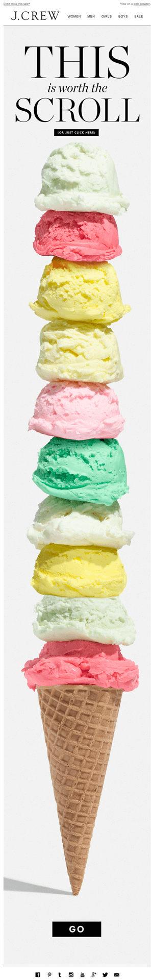
Indem J.Crew den Bildern den Vortritt lässt, weckt die Marke Emotionen, Neugier und Freude und zieht die Empfänger in ihre E-Mails. Durch die Untersuchung der E-Mail-Designs von J.Crew können wir die Kunst des visuellen Geschichtenerzählens erlernen und ansprechende Erlebnisse schaffen. Hier ist, warum diese E-Mail als gutes Beispiel für Design heraussticht.
Visuelles Geschichtenerzählen
Anstatt sich ausschließlich auf Text zu verlassen, lässt J.Crew das Bild sprechen. Die E-Mail zeigt ein fesselndes, hochauflösendes Bild eines Eisbechers, das sofort die Aufmerksamkeit auf sich zieht und Freude weckt. Das visuelle Element steht im Mittelpunkt und zieht die Empfänger an und weckt ihre Neugier.
Subtile Werbung
Obwohl die E-Mail einen Verkauf bewirbt, geht J.Crew subtil vor, indem es dies im ersten Text nicht erwähnt. Der Teaser “Das ist das Scrollen wert” weckt Neugier und ermutigt die Empfänger, weiter zu erkunden. Diese subtile Werbung bindet die Empfänger ein und verlockt sie, die Botschaft hinter dem Bild zu entdecken.
Interaktive visuelle Elemente
Das Design integriert ein interaktives Element, indem es die Spitze des Eisbechers als Richtungspfeil verwendet. Diese clevere Nutzung des visuellen Elements lenkt die Aufmerksamkeit der Empfänger auf die Handlungsaufforderung (CTA) und ermutigt sie, die gewünschte Aktion auszuführen. Es fügt der E-Mail eine spielerische und interaktive Dimension hinzu, die das Benutzererlebnis verbessert.
Liebe zum Detail
Die E-Mail zeigt Liebe zum Detail in Bezug auf die visuelle Komposition. Die Wahl eines langen, scrollbaren Bildes ermutigt die Empfänger, durch die E-Mail zu scrollen und zusätzliche Inhalte zu entdecken, während sie fortschreiten. Diese Technik erhöht das Engagement und stellt sicher, dass die Empfänger keine wichtigen Informationen verpassen.
Vereinfachtes Design
Das E-Mail-Design ist sauber und übersichtlich, sodass das Bild im Mittelpunkt steht. Der minimale Einsatz von Text sorgt dafür, dass der Fokus auf dem visuellen Element bleibt. Diese Einfachheit im Design verbessert die Gesamtästhetik und Lesbarkeit und erleichtert es den Empfängern, sich durch die E-Mail zu navigieren.
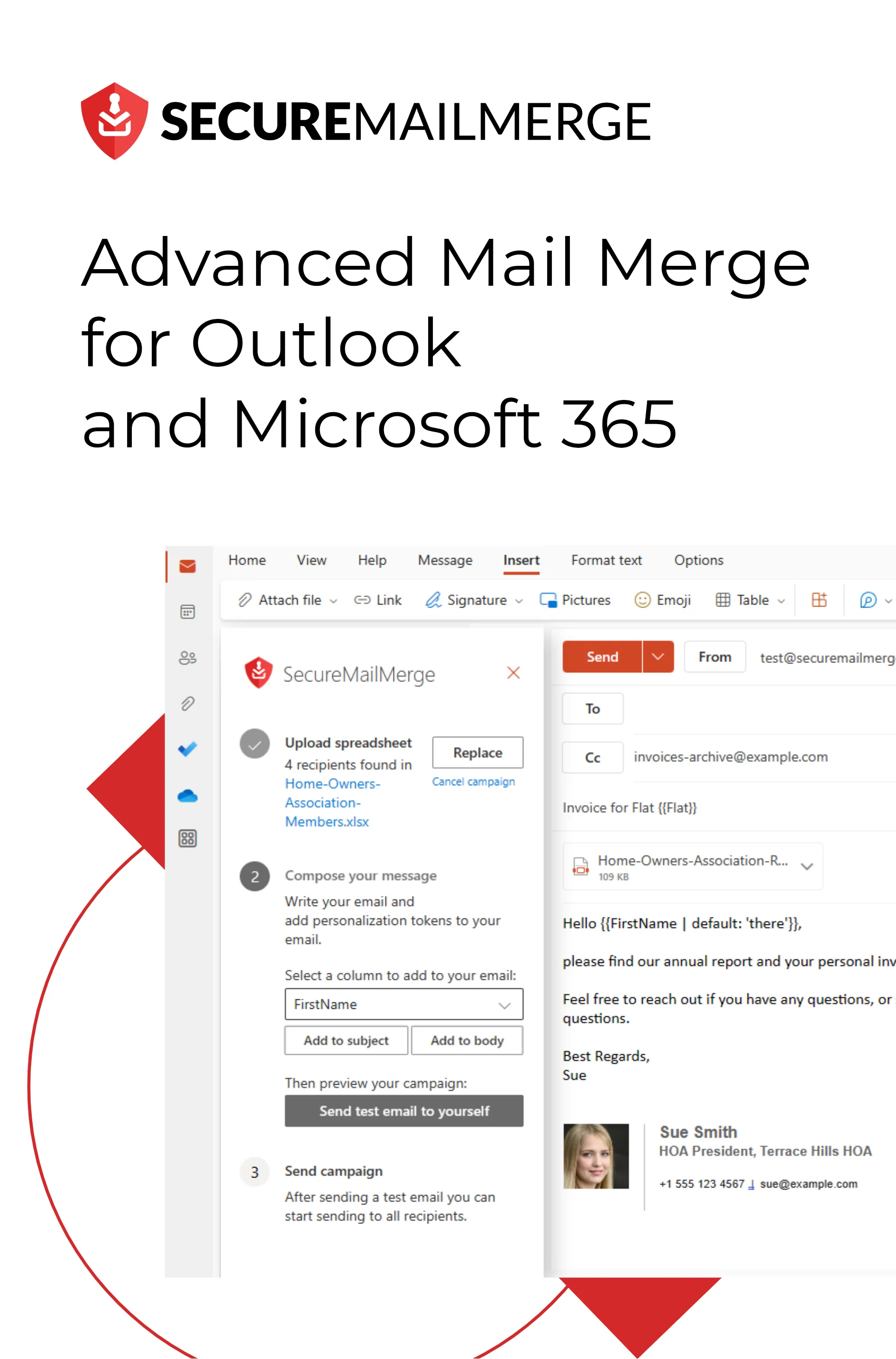
Personalisierte E-Mail-Designs für Outlook mit sicherem Mail Merge
Das Erstellen von Outlook-E-Mail-Vorlagen kann dein E-Mail-Design auf die nächste Stufe heben, indem es dir effiziente und einfache Lösungen bietet.
E-Mail-Vorlagen bieten eine strukturierte und effiziente Möglichkeit, mit Kunden zu interagieren, deine Botschaften zu optimieren und einen bleibenden Eindruck zu hinterlassen. Sie ermöglichen es dir, die Rücklaufquoten zu verbessern, Arbeitsabläufe zu vereinfachen und zu mehr Konversionen zu führen.
Personalisierte Kommunikation ist wichtiger geworden, da Unternehmen bestrebt sind, starke Beziehungen zu ihrer Zielgruppe aufzubauen.
Eine aktuelle Studie hat ergeben, dass jeder Dollar, der in E-Mail-Automatisierung und Marketing investiert wird, eine Rendite von 40 Dollar bringt. Dies unterstreicht die Notwendigkeit maßgeschneiderter Vorlagen, die bei den Empfängern Anklang finden und sie zum Handeln bewegen.

SecureMailMerge ist das ultimative Plugin für Outlook, das für Unternehmer, E-Mail-Marketer und alle, die mehrere Korrespondenzen verwalten, unverzichtbar ist.
Mit SecureMailMerge kannst du viele E-Mails direkt von deinem Microsoft 365-Konto aus senden, sodass sie so erscheinen, als hättest du sie persönlich gesendet. Dies verbessert die Zustellbarkeit und steigert die Rücklaufquoten erheblich, da Empfänger eher mit personalisierten und authentischen E-Mails interagieren.
Einige der herausragenden Funktionen sind:
- Nahtlose Integration mit deinem persönlichen oder gemeinsamen Adressbuch, um personalisierte E-Mails zu automatisieren.
- Unterstützung für verschiedene Tabellenformattypen zur Auswahl der Empfänger. Egal, ob du deine Empfängerdaten in Excel, CSV, TXT, Numbers, OpenDocument oder anderen Formaten gespeichert hast.
- Unbegrenzte Nachrichten- und Anhangsgröße, die es dir ermöglicht, Dateien im Mail Merge zu senden, lange Nachrichten, Videos oder mehrere Bilder nach Bedarf zu versenden.
Durch die Nutzung der Möglichkeiten von SecureMailMerge kannst du schnellere Ergebnisse erzielen und deine E-Mail-Kommunikation optimieren.
Installiere SecureMailMerge für Outlook und erlebe die Kommunikationsrevolution, die dein Unternehmen braucht und verdient.
Letztes Wort
Das Gestalten von ansprechenden E-Mails ist ein entscheidender Aspekt erfolgreichen E-Mail-Marketings. Indem du die in diesem Artikel besprochenen Schlüsselprinzipien und Best Practices einbeziehst, kannst du deine E-Mail-Designs aufwerten und ansprechende Erlebnisse für dein Publikum schaffen. Vom Verständnis der Bedeutung und Skalierbarkeit von E-Mail-Vorlagen bis hin zur Nutzung klarer CTAs und fesselnder visueller Elemente trägt jedes Element erheblich zur Steigerung von Engagement und Konversionen bei.
Denke daran, die mobile Responsivität zu priorisieren, die Marken-Konsistenz aufrechtzuerhalten und deine Designs kontinuierlich zu testen und zu optimieren, um die beste Leistung zu erzielen. Indem du die Kunst des E-Mail-Designs meisterst, kannst du wirkungsvolle Kampagnen erstellen, die einen bleibenden Eindruck hinterlassen und bemerkenswerte Ergebnisse für dein Unternehmen liefern.
Hat dir dieser Artikel gefallen?
Wir haben eine ganze Bibliothek mit nützlichen Artikeln für dich zum Lesen.
Zeig mir die Bibliothek der Outlook-Artikel.